First impressions matter immensely in business environments, and your reception area serves as the crucial gateway to your organisation’s identity. This space must simultaneously welcome visitors, facilitate efficient traffic flow, and reflect your brand’s professionalism. Modern reception design has evolved beyond simple aesthetic considerations to encompass ergonomic principles, accessibility standards, and sophisticated technology integration. The challenge lies in creating an environment that balances visual appeal with practical functionality, ensuring every visitor experiences comfort from the moment they enter your premises. Recent studies indicate that 73% of visitors form their initial impression of a company within the first seven seconds, making your reception layout a strategic business asset rather than merely a decorative afterthought.
Spatial planning principles for reception areas: circulation zones and traffic flow analysis
Effective spatial planning begins with understanding how people naturally move through spaces. Reception areas require careful consideration of circulation patterns to prevent congestion during peak hours whilst maintaining an inviting atmosphere during quieter periods. The concept of circulation zones divides your reception into distinct areas: primary pathways for movement, secondary zones for waiting, and tertiary spaces for ancillary functions like coat storage or information displays. Research from facilities management experts suggests that primary circulation routes should occupy approximately 30-40% of your total reception square footage, allowing comfortable passage even when the space reaches maximum capacity.
Calculating square footage requirements based on daily visitor volume
Determining appropriate spatial dimensions requires analysing your visitor data systematically. Industry standards recommend allocating 15-20 square feet per person in waiting areas, though this figure increases to 25-30 square feet when accommodating wheelchairs or mobility aids. For high-traffic corporate environments receiving 200+ daily visitors, you’ll need to calculate peak-hour capacity rather than average daily figures. A practical formula involves multiplying your maximum hourly visitor count by 20 square feet, then adding 40% buffer space to prevent overcrowding. This calculation ensures your reception never feels cramped, even during unexpected surges in foot traffic.
Implementing the 60-30-10 rule for reception furniture placement
The 60-30-10 rule, borrowed from interior design principles, provides an excellent framework for furniture distribution in reception spaces. Allocate 60% of your floor space to open circulation and primary functions, 30% to seating and waiting areas, and 10% to accent pieces like plants, artwork, or information kiosks. This proportion creates visual balance whilst maintaining functionality. The 60% circulation zone should include your main entrance, pathways to lifts or corridors, and the approach to your reception desk. The 30% seating allocation accommodates various waiting preferences, from individual chairs to collaborative seating clusters, whilst the 10% accent zone adds personality without cluttering the space.
Creating clear wayfinding pathways with strategic flooring materials
Flooring serves dual purposes in reception design: aesthetic expression and subtle wayfinding. Material transitions naturally guide visitors towards desired destinations without requiring signage. Consider using polished stone or porcelain tiles for main circulation routes, contrasted with carpet tiles in waiting areas to define spatial boundaries visually. This approach reduces confusion, particularly for first-time visitors unfamiliar with your building layout. According to environmental psychology research, people instinctively follow pathways defined by flooring changes, making this technique remarkably effective for directing traffic flow without explicit instruction.
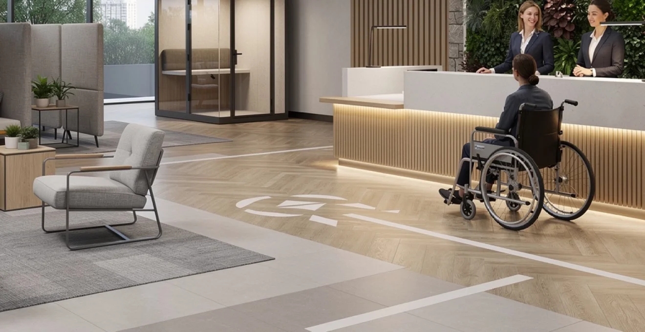
ADA compliance standards for Wheelchair-Accessible reception counters
Accessibility regulations mandate specific dimensions for reception counters serving visitors with disabilities. The Americans with Disabilities Act (ADA) requires at least one section of your reception desk to feature a counter height of 28-34 inches, with knee clearance extending 27 inches high, 30 inches wide, and 19 inches deep. In the UK, similar requirements exist under the Equality Act 2010, specifying maximum counter heights of 760mm for wheelchair users. Beyond legal compliance, inclusive design demonstrates your organisation’s commitment to welcoming all visitors regardless of physical ability. Position accessible counter sections prominently rather than tucking them into corners, ensuring visitors don’t feel marginalised when requesting assistance.
Ergonomic furniture selection: herman miller and steelcase solutions for Front-of-House environments
Front-of-house teams typically anchor their day at the reception desk, so prioritising ergonomic furniture from manufacturers like Herman Miller and Steelcase is essential for both health and performance. Poorly designed chairs, desks and storage can lead to fatigue, musculoskeletal disorders and reduced productivity, which in turn affects how warmly visitors are greeted. Investing in high-quality ergonomic solutions may appear costly at first glance, but studies from occupational health bodies repeatedly show that the long-term reduction in absenteeism and staff turnover more than offsets the initial outlay. When evaluating options, consider adjustability, lumbar support, and compatibility with the technology your receptionists use daily, from dual monitors to sit-stand configurations. By optimising the front-of-house workstations, you create a reception layout that supports comfort, style and operational efficiency in equal measure.
Modular seating systems: vitra alcove and teknion zones for flexible waiting areas
Waiting areas must adapt to changing visitor volumes and different types of meetings, which is why modular seating systems are invaluable. Collections such as Vitra Alcove and Teknion Zones allow you to reconfigure sofas, benches and privacy elements as your reception layout evolves. For example, you might cluster high-back Alcove units to create semi-enclosed pods for confidential conversations, while using lower, open seating for general waiting. This flexibility mirrors the way modern offices operate: agile, fluid and responsive to the day’s needs rather than fixed around a single static plan.
From a comfort and style perspective, modular seating also helps you fine-tune acoustics and privacy without resorting to permanent construction. High-back or hooded elements absorb sound and visually shield guests from the busier parts of the lobby, improving perceived calm even in high-traffic spaces. You can mix materials and colours within a single modular range to align with your brand palette whilst avoiding a monotonous look. When planning the layout, maintain at least 36 inches (about 915mm) of clearance around seating clusters to preserve traffic flow and comply with accessibility standards. This approach ensures your reception waiting area remains both adaptable and inviting as your organisation grows.
Reception desk height standards: standing vs. seated workstation configurations
The reception desk is both a visual focal point and an ergonomic workstation, so its height and configuration demand careful analysis. Traditional designs often default to high counters that prioritise privacy for staff but can feel imposing to visitors. Contemporary best practice leans towards a mixed-height solution, combining a lower, ADA-compliant section for seated interaction with a higher standing section for quick check-ins and document exchange. A typical seated work surface ranges between 28-30 inches (710-760mm), while standing counters generally sit around 40-42 inches (1015-1065mm), providing a comfortable elbow height for most adults.
Why consider standing configurations at all? Research on workplace wellness shows that alternating between sitting and standing throughout the day reduces fatigue and improves alertness, which is crucial for staff who are constantly interacting with the public. Sit-stand reception desks, similar to those used in open-plan offices, enable staff to adjust their posture without compromising the visual harmony of the reception layout. When specifying your desk, ensure there is adequate depth (at least 24-30 inches / 610-760mm) for keyboards, screens and paperwork, with cable management built in to avoid clutter. By aligning desk height standards with both ergonomic science and aesthetic goals, you improve staff wellbeing while reinforcing a clean, contemporary front-of-house look.
Task lighting requirements: lux levels and colour temperature for visual comfort
Lighting at the reception desk is more than a decorative consideration; it directly impacts eye strain, accuracy and perceived professionalism. Industry guidelines typically recommend 300-500 lux for general reception areas, rising to 500-750 lux at task surfaces where reading, writing and screen work occur. Under-lighting forces staff to squint and increases error rates, whereas harsh over-lighting creates glare that can be equally uncomfortable. A balanced approach combines ambient lighting with targeted task lamps, allowing individuals to fine-tune brightness for their own visual comfort.
Colour temperature plays a crucial role in shaping mood and visual clarity. Neutral white light in the 3500K-4000K range is generally ideal for reception desks, providing a crisp but welcoming tone that renders skin and fabric colours accurately. Cooler temperatures (5000K+) can feel clinical, while very warm light (2700K) may be too dim or yellow for reading detailed documents. Adjustable LED task lights from premium brands let staff tailor both intensity and colour temperature across the day, mirroring natural daylight patterns. By treating task lighting as an integral component of your reception layout, you support both visitor comfort and the micro-tasks that keep front-of-house operations running smoothly.
Acoustic furniture integration: soundproofing panels and privacy pods
Reception areas often suffer from high noise levels due to hard surfaces, open volumes and constant movement, which can undermine comfort and confidentiality. Acoustic furniture helps address this challenge without resorting to heavy architectural interventions. Sound-absorbing panels, upholstered wall tiles and freestanding baffles reduce reverberation, making conversations clearer and less intrusive. Placing these elements around the reception desk and along primary circulation routes can significantly lower ambient noise, especially in double-height lobbies or spaces with extensive glazing.
For settings that handle sensitive discussions—such as healthcare, legal or financial services—integrating privacy pods or acoustic booths is particularly effective. These self-contained units act like mini meeting rooms, providing a controlled acoustic environment for short consultations or video calls. Think of them as “silence capsules” within the broader reception layout, much like quiet carriages on a busy train. Position pods slightly away from main traffic flows, but within clear sight of the reception desk so visitors can be guided to them easily. This combination of acoustic furniture and thoughtful zoning results in a reception space that sounds as calm and composed as it looks.
Biophilic design elements: incorporating natural materials and living walls
Integrating biophilic design into your reception layout is one of the most effective ways to elevate both comfort and style. Biophilic design leverages our innate connection to nature by introducing natural materials, greenery and organic forms into built environments. Multiple studies have shown that exposure to plants and natural textures reduces stress, lowers heart rates and improves overall mood—ideal outcomes for visitors who may be anxious about meetings, interviews or medical appointments. By treating the reception as an indoor landscape rather than a purely functional lobby, you create a more nurturing and memorable first impression.
Practical applications range from living walls and potted trees to timber-clad reception desks and stone flooring. Living walls, in particular, act as visual anchors that can also improve indoor air quality and acoustics, softening echoes in hard-surfaced areas. If a full green wall exceeds your budget or maintenance capacity, consider modular planters, hanging greenery or even digital nature displays that mimic outdoor scenes. Natural light should be maximised wherever possible, supported by full-spectrum artificial lighting when daylight is limited. The goal is to create a reception environment where visitors instinctively feel more relaxed, as they might in a well-designed garden or hotel lobby.
Colour psychology and material palettes: sherwin-williams and farrow & ball professional schemes
Colour and material choices in your reception layout are powerful tools for shaping perception, often before a single word is spoken. Professional paint systems from brands like Sherwin-Williams and Farrow & Ball offer carefully curated palettes that ensure consistency across walls, millwork and accent elements. When you align your reception colour scheme with your brand values—whether calm and clinical, warm and hospitable, or bold and innovative—you help visitors intuitively understand who you are. Material choices such as wood, stone, metal and textiles then add tactile depth, reinforcing the emotional tone set by your chosen hues.
Working with established professional schemes also simplifies maintenance and future updates. Standardised colour codes and finishes make it easy to match touch-up paint, replace damaged panels or expand your layout into adjoining spaces. Many organisations develop a reception “materials library” that specifies preferred paint lines, laminates and fabrics, ensuring continuity even when refurbishments occur years apart. In this way, colour psychology and material palettes become strategic tools, not afterthoughts, supporting a reception experience that feels cohesive from floor to ceiling.
Warm vs. cool tones: psychological impact on visitor perception and dwell time
Warm and cool tones elicit different psychological responses, so your choice should be informed by the type of experience you want visitors to have. Warm hues—soft beiges, terracottas and muted yellows—tend to create a cosy, approachable atmosphere that shortens perceived waiting times. They are particularly suited to hospitality, healthcare and residential-style offices where reassurance and relaxation are priorities. Cool tones—blues, blue-greys and some greens—convey calm, focus and professionalism, making them popular in corporate, financial and technology environments. They can, however, feel stark if overused without balancing textures.
You can think of warm versus cool tones like background music in a film: barely noticed consciously, but vital in setting the emotional script. Many organisations blend the two, using cooler hues on major wall planes to create a sense of space and cleanliness, then introducing warmth through timber furniture, upholstery and artwork. Research into retail and hospitality environments suggests that warmer schemes often encourage longer dwell times, while cooler schemes support clarity and efficiency. By intentionally calibrating this balance, you can nudge visitors towards the behaviours you value most—whether that is relaxed conversation in a lounge-style lobby or brisk, focused movement in a time-sensitive clinic reception.
Texture layering techniques: combining stone, wood, and textile finishes
Texture is the silent partner of colour in reception design, adding depth and sophistication without overwhelming the senses. A well-layered scheme might combine smooth stone or terrazzo flooring in circulation zones with warm timber cladding at the reception desk and soft textiles in seating areas. This contrast helps visitors intuitively distinguish between “movement” and “rest” zones, much like different terrains guide you along a hiking trail. Textural variety also catches light in different ways, creating subtle visual interest that makes a reception feel richer and more thoughtfully designed.
When layering textures, aim for a balanced mix of three to four primary materials to avoid visual clutter. For example, pair a matte stone floor with oak wall panels, wool upholstery and brushed metal accents for a contemporary yet timeless look. High-wear areas should favour durable, easy-clean finishes, with softer textiles used where direct contact is most frequent, such as cushions and seat backs. Consider tactile experience as well as appearance: how does a visitor’s hand feel when they rest it on the desk edge, or when they sit back in a lounge chair? By orchestrating textures with the same care as a fashion designer layering fabrics, you elevate your reception from functional to genuinely experiential.
Brand identity integration through accent colours and proprietary pantone matching
Integrating brand identity into your reception layout goes beyond hanging a logo behind the desk. Accent colours, graphics and even lighting can subtly echo your brand palette, reinforcing recognition without overwhelming the space. One effective strategy is to keep primary surfaces—walls, ceilings and major furniture pieces—neutral or softly toned, then introduce brand colours through smaller elements such as cushions, feature chairs, signage and artwork. This creates a sophisticated backdrop where your brand accents read as deliberate highlights rather than overpowering statements.
For organisations with strict brand guidelines, proprietary Pantone references can be translated into paint, fabric and laminate equivalents via professional tools offered by manufacturers. Working closely with your design team, you can specify, for instance, a Farrow & Ball or Sherwin-Williams hue that approximates your primary brand colour while remaining suitable for large surfaces. Accent lighting, such as LED strips or feature pendants, can also be tuned to echo brand tones, especially in evening or low-light conditions. By embedding brand identity at this granular level, your reception becomes a three-dimensional expression of your visual language, leaving visitors in no doubt about where they are and what you stand for.
Lighting design strategy: layered illumination with philips hue and lutron systems
A sophisticated reception layout relies on layered lighting to balance aesthetics, comfort and energy efficiency. Rather than depending on a single grid of ceiling fixtures, you can combine ambient, task and accent lighting to create depth and flexibility. Ambient lighting provides overall brightness, usually through recessed downlights or indirect coves. Task lighting focuses on functional zones such as the reception desk and reading areas, while accent lighting highlights architectural features, artwork or signage. This layered approach ensures that no part of the reception feels overlit or dim, and it allows you to adjust scenes for different times of day or types of events.
Smart control systems from providers like Philips Hue and Lutron make implementing this strategy considerably easier. With programmable scenes, you can set brighter, cooler light for morning rush periods, then transition to warmer, softer tones in the late afternoon to support relaxation. Occupancy sensors and daylight harvesting further optimise energy use, automatically dimming artificial lighting when natural light levels rise. Think of your lighting control like a sound mixing desk: each channel (ambient, task, accent) can be raised or lowered to create the right “mood track” for your reception. In addition to enhancing visitor comfort, intelligent lighting schemes contribute to sustainability targets and can even support circadian rhythms for staff who spend long hours at the front desk.
Technology integration: digital signage, visitor management software, and contactless check-in solutions
Modern reception areas increasingly function as technology hubs, where digital tools streamline processes and elevate the visitor experience. Digital signage replaces static posters with dynamic content—wayfinding, meeting room allocations, brand storytelling or live data feeds—that can be updated in real time. Strategically placed screens near entrances and lifts reduce the need for printed materials and manual directions, lowering operational overheads and visual clutter. The key is to ensure screens are at comfortable viewing heights, with content designed for quick comprehension rather than dense reading.
Visitor management software and contactless check-in systems further optimise both security and convenience. Guests can pre-register via email, scan a QR code on arrival and receive temporary badges or digital passes without lengthy queues at the desk. These systems also generate valuable analytics on visitor traffic patterns, helping you refine spatial planning and staffing levels over time. In environments where hygiene remains a priority, touchless interfaces—such as motion-activated kiosks or mobile-based check-in—offer reassurance alongside efficiency. The reception desk then shifts from an administrative bottleneck to a concierge-style touchpoint, where staff focus on personal interaction rather than manual data entry.
Integrating technology into your reception layout should always be done with an eye on aesthetics and ergonomics. Cables must be managed discreetly, screens should not dominate sightlines, and audio alerts need to be calibrated so they do not disturb the calm of the space. When executed well, technology becomes almost invisible, operating like a well-tuned engine beneath a beautifully designed car. Visitors experience a seamless, contactless journey—finding their way, checking in and waiting in comfort and style—while your organisation benefits from enhanced security, data and workflow efficiency.