Creating a cohesive reception theme transforms an ordinary celebration into an extraordinary experience that reflects your unique style and personality as a couple. The artistry lies not merely in selecting beautiful individual elements, but in weaving them together to form a harmonious narrative that captivates guests from the moment they enter your reception space. Every successful wedding reception design begins with understanding how different elements—from colour psychology to architectural features—work in concert to create an atmosphere that feels both intentional and effortlessly elegant.
Professional wedding designers understand that cohesion doesn’t happen by accident; it requires careful planning, attention to detail, and a deep appreciation for how various design elements interact with one another. When executed properly, a cohesive theme creates an immersive environment where guests feel transported into your carefully curated vision, whether that’s a romantic garden party, an elegant ballroom affair, or a modern industrial celebration.
Colour psychology and visual cohesion in reception design
The foundation of any successful reception theme begins with understanding how colours influence mood, atmosphere, and guest experience. Colour psychology plays a crucial role in reception design, as different hues can evoke specific emotions and create desired ambiances. Warm tones like deep reds, golden yellows, and rich oranges create feelings of intimacy and celebration, whilst cool blues, soft greens, and lavender tones promote tranquility and elegance.
Research indicates that guests form their first impressions of an event within the initial 30 seconds of arrival, making colour choices particularly significant in setting the tone for your celebration. The human brain processes visual information 60,000 times faster than text, which explains why a well-coordinated colour scheme can instantly communicate your wedding’s style and personality before guests even examine individual decorative elements.
Pantone colour matching systems for event coordination
Professional event designers increasingly rely on Pantone colour matching systems to ensure consistency across all reception elements. This standardised colour system eliminates guesswork when coordinating with multiple vendors, from florists to linen suppliers. Using specific Pantone references ensures that your blush pink bridesmaid dresses match perfectly with your table linens and floral arrangements, creating the seamless visual flow that distinguishes professionally designed events.
The Pantone Color Institute releases annual trend forecasts that can inspire contemporary reception themes whilst ensuring your colour choices feel current and sophisticated. Wedding planners often recommend selecting three to four Pantone colours as your primary palette, then incorporating one or two accent colours for depth and visual interest.
Complementary and analogous colour schemes in wedding reception palettes
Understanding colour wheel relationships elevates reception design from amateur to professional. Complementary colour schemes, using colours directly opposite each other on the colour wheel, create dramatic visual impact and energy. Consider pairing deep navy with warm coral, or rich burgundy with sage green for sophisticated contrast that photographs beautifully.
Analogous colour schemes, featuring colours adjacent on the colour wheel, produce more harmonious and calming effects. These palettes work exceptionally well for romantic or garden-inspired themes, such as combining soft pink, coral, and peach tones, or blending various shades of blue from powder to navy.
Cultural colour symbolism across different reception traditions
Incorporating cultural colour symbolism adds meaningful depth to reception themes whilst honouring heritage and traditions. In Chinese culture, red symbolises luck and prosperity, making it an auspicious choice for wedding celebrations. Indian traditions often feature vibrant marigold orange and deep red, representing purity and fertility.
Western traditions have evolved to embrace broader colour palettes, though white remains symbolic of purity and new beginnings. Modern couples increasingly blend cultural colour traditions, creating unique palettes that honour multiple heritages whilst maintaining visual cohesion throughout their reception design.
Lighting temperature effects on perceived colour harmony
The relationship between lighting temperature and colour perception significantly impacts reception atmosphere. Warm lighting (2700K-3000K) enhances reds, oranges, and yellows whilst making blues appear muted. Cool lighting (4000K-5000K) brings out blues and greens but can make warm colours appear less vibrant.
Professional lighting designers recommend layering different light sources
Professional lighting designers recommend layering different light sources to maintain colour harmony as the event progresses. During daylight or cocktail hour, you might rely more on natural light and cooler uplighting, then transition to warmer candlelight and dimmable fixtures as the evening becomes more intimate. Always request a lighting demonstration with your planner or venue team, bringing physical samples of linens, florals, and stationery to see how they read under various colour temperatures. This simple test can reveal whether your chosen reception palette still feels cohesive in low light, on camera, and across different areas of the space. When in doubt, opt for adjustable, warm-to-neutral lighting, which tends to flatter both people and decor in wedding reception design.
Textile selection and fabric coordination strategies
Textiles are one of the most powerful tools for creating a cohesive reception theme, yet they are often treated as an afterthought. The fabrics you choose for linens, draping, chair covers, and even napkins influence not only the visual design but also the tactile experience for your guests. High-quality textiles can instantly elevate a simple venue, while inconsistent fabrics can disrupt even the most carefully chosen colour palette. By understanding linen weights, texture layering, and seasonal fabric choices, you can ensure every textile in your reception design supports the same story.
Linen weight classifications for table settings and draping
Linen weight is typically measured in grams per square metre (GSM), and it directly affects how a fabric hangs, feels, and photographs. Lightweight textiles (around 120–180 GSM) such as polycotton blends work well for casual receptions, overlay cloths, and ceiling draping because they are easy to handle and create soft movement. Medium-weight linens (180–240 GSM), including many cotton and cotton-sateen options, are ideal for standard banquet tables, providing enough body to look polished without appearing stiff. Heavyweight linens (240 GSM and above), often used in luxury wedding design, create a more tailored, opulent look that hides table legs and imperfections while adding a sense of grounded sophistication.
When planning your reception layout, you can think of linen weights as you would clothing layers in your wardrobe: the base layer should be practical and comfortable, while the outer layer provides structure and style. Heavier cloths suit formal seated dinners and classic ballroom receptions, especially when paired with structured chairs and formal place settings. Lighter fabrics, by contrast, are better suited to marquee weddings, beach receptions, or garden parties where you want the design to feel airy and relaxed. Asking your rental company for GSM specifications or fabric samples allows you to compare options side-by-side and choose the weight that best supports your overall reception theme.
Texture layering techniques using chiffon, satin, and organza
Just as colour layering adds depth to a palette, texture layering adds dimension to your reception decor. Chiffon, satin, and organza are three of the most commonly used fabrics in wedding reception design, and each brings a different textural quality to the space. Chiffon is soft, semi-sheer, and fluid, perfect for table runners, chair ties, and ceremony backdrops where you want movement and a romantic, ethereal feel. Satin has a smooth, lustrous surface that reflects light beautifully, making it ideal for formal tablecloths, napkins, or accent linens on key tables like the cake or sweetheart table.
Organza sits between chiffon and tulle in terms of structure; it is sheer but slightly crisper, which makes it excellent for structured chair sashes, ceiling swags, and layered overlays. To create cohesive texture layering, choose one dominant textile and one or two supporting textures that echo your overall theme. For example, a modern minimalist reception might pair matte polyester linens with subtle satin napkins and a single organza runner for dimension. A romantic garden reception, on the other hand, could mix flowing chiffon runners with textured lace overlays and soft cotton napkins. The goal is to avoid a “fabric showroom” effect by repeating the same key textures consistently across the reception design.
Seasonal fabric considerations for outdoor reception venues
Seasonal considerations are particularly important for outdoor receptions, where fabric performance can make or break guest comfort. In warmer climates or summer weddings, breathable, lightweight textiles such as cotton, linen, and semi-sheer chiffon help maintain a relaxed, airy atmosphere. Heavier fabrics may trap heat and appear visually dense in bright sunlight, making tables feel crowded rather than inviting. In cooler seasons or evening receptions, weightier linens, velvets, or textured weaves add warmth and visual richness, especially when combined with candlelight and layered place settings.
Wind, humidity, and potential rain also influence fabric selection in outdoor reception design. Stiffer fabrics like organza and taffeta hold their shape better in breezy conditions, whereas ultra-light chiffon may fly away or appear messy without proper anchoring. For coastal venues or garden marquees, weighted tablecloth clips, double-clipped overlays, or runner ties can preserve your styling choices throughout the event. Considering the season and environment when selecting textiles ensures that your cohesive reception theme not only looks beautiful, but also functions effectively for you and your guests.
Care instructions and wrinkle-resistance properties for event textiles
Behind every polished reception lies careful attention to fabric care and wrinkle management. Some textiles, such as polyester blends and certain performance linens, are naturally wrinkle-resistant and ideal for weddings that require fast setups or have limited access to steaming equipment. Natural fibres like pure cotton and linen can offer a luxe, organic look but crease more easily, demanding meticulous pressing and careful handling on the day. When comparing options, ask your rental company or stylist how each fabric behaves in transit and whether professional pressing is included in the service.
Practical planning around textile care can significantly reduce day-of stress. If you are sourcing your own linens, confirm whether they are machine-washable, whether they can handle commercial pressing, and how they should be stored to avoid damage. For destination weddings or DIY setups, wrinkle-resistant fabrics are often the most reliable choice for maintaining a cohesive look across all reception tables. Thoughtfully chosen textiles that are both beautiful and manageable ensure your colour palette and styling details appear crisp, cohesive, and intentional from the first photograph to the last dance.
Floral design integration and botanical theme development
Floral design is often the most immediately noticeable element of a cohesive reception theme, bridging the gap between colour palette, textiles, and architecture. Well-planned florals reinforce your chosen aesthetic, whether that’s lush and romantic, clean and architectural, or wild and garden-inspired. Rather than thinking of flowers as stand-alone decor, consider them as part of a broader botanical story that runs from your ceremony to your reception tables and even your wedding cake. This narrative approach helps avoid a disjointed look, even if you use a mix of flower types and arrangements.
Begin by identifying two or three “hero” blooms that will anchor your wedding floral design, such as garden roses, peonies, orchids, or dahlias. Then, add supporting flowers and greenery that echo your colour palette and desired level of formality. For example, delicate sweet peas and ranunculus suit romantic, fine-art styles, while structured calla lilies and anthuriums feel more modern and sculptural. Repeating the same floral varieties in key moments—bouquets, centrepieces, ceremony installations, and bar arrangements—creates subconscious recognition for guests, making the entire reception design feel cohesive and intentional.
Seasonality is another important factor in cohesive floral design. Choosing in-season blooms not only tends to be more cost-effective, but also results in arrangements that feel natural to the time and place of your celebration. Many florists now use a “colour story first” approach, selecting exact varieties closer to the date based on market availability while remaining within your established palette. To protect cohesion, share your mood boards, textile samples, and reception layout with your florist so they can scale arrangements appropriately and integrate floral elements into every layer of the reception space, from escort card displays to restrooms and lounge areas.
Venue architecture analysis and space planning coordination
Even the most beautiful decor will feel disjointed if it fights against the venue’s architecture rather than working with it. Analysing your reception venue’s lines, proportions, and key features allows you to design a layout and decor plan that feels natural and cohesive. High ceilings, exposed beams, grand staircases, or historic mouldings can all become anchor points for your theme instead of obstacles. Think of the venue as the frame for your artwork; the more aligned your reception design is with the existing structure, the more effortless and immersive the experience will feel.
Start by walking the space and noting the guest’s natural journey: where they enter, where their eyes are drawn first, and how they will move between cocktail hour, dining, and dancing. Identify visual focal points—such as fireplaces, windows, or central chandeliers—and decide whether to highlight or soften them with decor. For example, a modern industrial venue with brick walls and metal beams might call for linear floral installations and minimalist table styling that echo its geometry. A classic ballroom, conversely, may benefit from symmetrical layouts, tall centrepieces, and draped lighting that emphasise its formal character.
Space planning is also crucial for maintaining a cohesive reception experience. Adequate flow between tables, bars, and dance floors ensures that important design elements are visible and functional rather than cramped or overlooked. Strategic placement of high-impact pieces—like a statement cake table, a floral escort-card display, or a custom bar—creates a sense of progression throughout the evening. When every design decision is informed by the venue’s architecture and guest flow, the result is an environment where decor, layout, and experience all tell the same story.
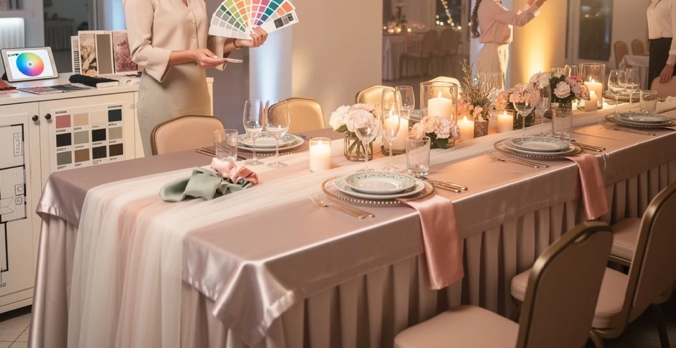
Tableware and place setting specification guidelines
Tableware acts as the bridge between visual design and guest experience, transforming your colour palette and theme into something guests physically interact with. Plates, glassware, and cutlery may seem purely functional, but they play a significant role in how polished and cohesive your reception appears. Professional planners treat the dining table as a microcosm of the overall design: if the place settings feel harmonious, the rest of the reception is more likely to feel intentional as well. Careful choices in china, glassware, and flatware can instantly shift your reception from casual to elevated, or from traditional to contemporary.
China pattern mixing techniques for elegant table compositions
Thoughtful pattern mixing in china can create rich, layered tabletops without overwhelming the eye. The key is to establish a visual hierarchy: choose one dominant pattern, one subtle supporting pattern, and, if desired, a solid-colour anchor. For instance, you might pair a floral-patterned dinner plate with a simple rimmed salad plate and a solid charger that picks up one of the pattern’s accent colours. This approach allows you to introduce personality and character while still maintaining a cohesive reception theme across all your tables.
Scale and repetition are your allies when mixing china patterns. Large-scale patterns work best on the largest plate or charger, while smaller details are better suited to side plates or bread plates. Repeating the same pattern mix across all guest tables (or at least across table “zones”) prevents the design from feeling random, even if each place setting has a slightly unique touch, such as a different coloured napkin knot or personalized place card. As with textile layering, limiting your palette and sticking to two or three coordinating china patterns helps the whole table look curated rather than chaotic.
Glassware selection hierarchy from water goblets to champagne flutes
Glassware is often one of the most visible elements on a reception table, catching and reflecting light throughout the evening. A well-considered glassware hierarchy—typically including water goblets, wine glasses, and champagne flutes—contributes both to visual rhythm and guest comfort. At a minimum, formal receptions usually feature a water glass and one universal wine glass, with additional glasses added as the menu complexity increases. Coloured or etched glassware can reinforce your reception palette, especially when used consistently across all tables.
When choosing glassware for a cohesive reception design, consider both the silhouette and the quantity placed at each setting. Slim, tall stems feel refined and elegant, while shorter, rounded goblets can lend a more relaxed, old-world charm. Aligning glassware style with your overall theme—crystal cut for classic ballrooms, smoke-tinted glass for modern industrial venues, or vintage coupes for retro-inspired celebrations—ensures that every detail on the table supports the same aesthetic story. As a rule of thumb, avoid overcrowding each place setting with unused glass types; it is better to have fewer, well-chosen pieces that will actually be used.
Cutlery placement protocols according to multi-course menu planning
Cutlery arrangement not only signals the level of formality but also guides guests through the dining experience. Traditional etiquette places utensils in the order of use, working from the outside in: starters and salad cutlery on the outer edges, followed by main course cutlery closer to the plate, and dessert utensils either above the plate or brought in later. Aligning the number and type of utensils with your actual menu is essential; unnecessary cutlery can clutter the table and confuse guests, undermining the clean, cohesive look you are aiming for.
For more relaxed receptions or family-style service, you might simplify place settings to a single knife and fork, adding extra cutlery only when needed. In contrast, tasting menus or multi-course plated dinners often warrant a more elaborate setup. Whatever your approach, make sure the metal finish—polished silver, brushed gold, black matte, or mixed metals—matches other hardware elements such as candleholders, charger rims, or place card holders. This repetition of finishes across the table subtly reinforces cohesion, even if guests cannot immediately identify why the design feels so harmonious.
Charger plate materials and their impact on overall table aesthetic
Charger plates serve both a functional and aesthetic role, framing the place setting and anchoring the table design. The material you choose—whether glass, metal, rattan, acrylic, or ceramic—can dramatically influence the overall mood of your reception. Glass and acrylic chargers with clean lines work beautifully in modern or minimalist schemes, while ornate metal chargers lend themselves to formal and traditional settings. Textured chargers such as rattan or wood are ideal for rustic, coastal, or garden-inspired receptions, adding organic warmth beneath more refined tableware.
Chargers also provide an opportunity to introduce or reinforce accent colours within your wedding reception palette. A subtle metallic rim might echo the flatware and candleholders, while a soft-coloured charger can ground neutral linens and white china. To maintain cohesion, limit the number of charger styles used and ensure they are consistent within each guest area or seating zone. When chargers, linens, china, glassware, and cutlery all feel like they belong to the same “family,” your tablescapes become a powerful expression of your cohesive reception theme.
Lighting design systems and ambient atmosphere creation
Lighting is often described as the invisible design element because, when done well, guests remember how the room felt rather than the fixtures themselves. A thoughtfully planned lighting design system shapes mood, highlights key features, and subtly directs attention throughout the reception. Ambient lighting sets the overall tone, while task and accent lighting highlight specific areas like the bar, dance floor, or cake table. Instead of relying solely on existing venue fixtures, consider how layered lighting—combining overhead fixtures, uplighting, candles, and pin-spotting—can support and enhance your cohesive reception theme.
One effective approach is to plan your lighting in phases that mirror the flow of the evening. During guest arrival and dinner, you might favour softer, more ambient lighting that encourages conversation and allows decor details to shine. As the night progresses into dancing, you can introduce more dynamic lighting elements such as colour washes on walls or subtle movement on the dance floor. Throughout, candles and low-level accent lights maintain warmth and intimacy. Think of lighting as the soundtrack for your visuals: it changes pace and intensity, but always within the same style, so your guests feel guided rather than jolted from one moment to the next.
Coordination between your planner, lighting designer, and other vendors is critical for maintaining visual cohesion. Florals should not block key light sources, and reflective surfaces like glassware and mirrors should be positioned to enhance, not disrupt, the lighting plan. Photographers can also advise on how certain lighting choices will translate on camera, helping you avoid overly harsh spotlights or colour casts that distort your carefully chosen palette. When lighting is treated as an integral design layer rather than a last-minute add-on, your reception space becomes immersive, flattering, and unforgettable—an environment where every element, from linens to florals to architecture, is seen in its best possible light.